Iron Viz games, CrossFit edition

This year’s Iron Viz theme was games — anything that includes a dedicated rule set, has a scoring matrix, and involves at least two participants or teams, and results in some form of reward for the players. As we trended closer to the submission date, I noticed a good deal of this year’s entrants opted for the organized professional sports leagues and a wide variety from around the planet. Soccer (or fútbol, depending on your origin,) basketball, cricket, baseball all made an appearance — as expected. Just as unsurprisingly, Tableau HQ had a bit of difficulty wrapping their heads around what, precisely, CrossFit -is- as they messaged me originally that my entry wasn’t related to games (although, to their credit, after pointing them to the site including the rulebook, scoring, and the actual link to the event literally titled “CrossFit Games” they recanted and accepted my entry.) Even diehard Crossfitters define the sport incongruently [“The sport of fitness”…? How does that work?]
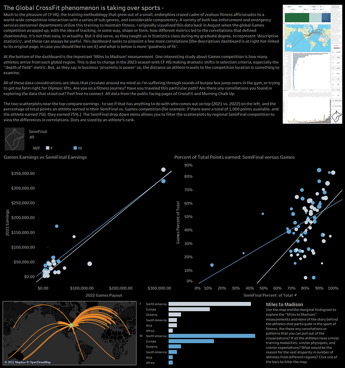
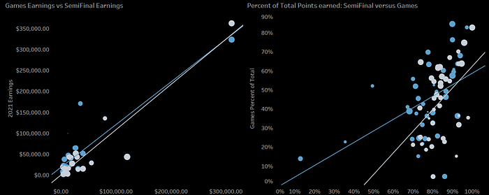
Interesting visuals included in the second dashboard you’ll notice are the two correlation charts. These were specifically important because — as any good statistician will tell you — the first thing you do with any new data set is start with descriptives. Afterwards, look for the correlations. Essentially, that’s what the most important part of the two sports related dashboards are: the original was all the descriptive statistics, and the second specifically looks at what has the strongest match between two factors to show a trend line up and to the right.

This particular operation required a good deal of trial and error, as there’s no magic button to tell you which two factors are going to have the strongest correlation. In that way, it’s a little like how I remember using SPSS: while working on these in that other program, you’d have to constantly tick and untick boxes in order to figure out which was the factor that had the greatest effect. In this case, we’re organizing pills, but still.
It turns out that the two areas of greatest influence on an athlete’s games performance are their SemiFinal scores [measured by Percent of Total available points — not the raw score,] and how much they earned after the previous year’s season. A simple caveat: these are just the data available in the public space. Athletes have millions of data points that they are tracking — sleep, nutrition, repetitions, periodization, sponsorships, so many factors that are simply not included in this data set and we would have no way of knowing because those are all part of the secret sauce. So, as I’m declaring that the correlations are visible, also understand that they are restricted to only the publicly available data that is quite restricted. However, the point is — given the appropriately sized data set and a modicum of computing resources, — we could get to a much closer ‘goodness of fit’ with regards to correlations (or, we may find out that we were correct with just these!)
In any case, the fitness aspect, the bright colors, and the Iron Viz entry were all a great deal of fun with regards to this dashboard! Happy to have been able to participate this year, and happy that it was accepted! As always, find me on LinkedIn, Instagram, or my website. Would love to hear what everyone is doing about their Twitter profiles. Are you staying? Are you going? Are you chewing on a serving of Mastodon steak? Let me know your thoughts.
